
Widget Placements and Design for Free Gift BOGO BXGY App
Widget Placements & Design
Placements
| Placement | Where it appears |
|---|---|
| Cart | Inside the cart drawer or cart page. |
| Product Page | On product detail pages. |
| Floating Gift | A floating button anchored to a corner of every page. |
| Announcement Bar | A full-width bar at the top or bottom of every page. |
Each placement is published independently — open its tab and click Publish at the bottom. A green dot on a tab means that placement is live. Unpublishing a placement takes its widget off your store immediately.
Running an offer with no widget
Stopping the offer entirely
Widget Type
Two layouts are available per placement:
- Minimal — compact strip. Works well in cart and announcement bar.
- Optimal V2 — richer card with gift image, progress bar, and multi-gift support.
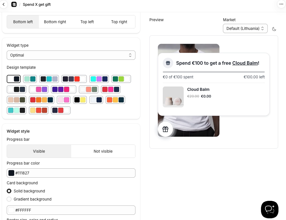
When Optimal V2 is selected and you have more than one gift product, a Gift style option appears: - Carousel — gifts scroll left and right - Stacked — gifts are listed one below the other
Design Templates
20 pre-built color presets are available. Selecting one applies a full color scheme (background, border, button colors, text, progress bar) instantly.

Tip: Use the sun/moon button above the preview to check your widget against a light or dark background — useful if your store uses a dark theme.
Content States
The Content section has tabs for the text shown in each gift state:
- Gift locked — before the customer qualifies (always shown)
- Gift unlocked — after they qualify but before adding the gift (only in Manual adding mode)
- Gift added — after the gift is in the cart
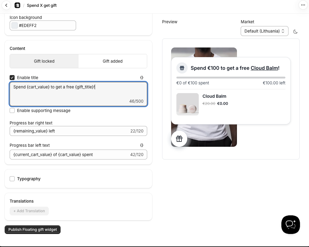
Each state has editable text for: title, progress bar label, and button text. Use the {} button to insert dynamic variables like {product_title} , {gift_title} , or {amount_remaining} .
Page Targeting
Control exactly which pages the widget appears on.
Product Page: - All products (default) - Specific collections - Specific products - Custom position (manual placement via app block)
Floating Gift & Announcement Bar: - Every page — with optional exclusions (home, cart, blogs, specific URLs, etc.) - Home page only - All product pages - Products in specific collections - Specific product pages
Widget Position
| Placement | Options |
|---|---|
| Cart | Top / Bottom |
| Product Page | Above Add to Cart / Below Add to Cart |
| Announcement Bar | Top / Bottom. When set to Top, a Sticky option makes the bar stay visible while scrolling. |
| Floating Gift | Bottom left / Bottom right / Top left / Top right |
Other Design Options
- Background — solid color or gradient (with angle control)
- Border — width (px), color, and corner radius
- Progress bar — show/hide and set the fill color
- Gift image — show/hide the gift product image (Minimal widget type)
- Icon — show a small icon next to the title; set icon image, size, and color
- Typography — override the font (Inter, Roboto, Open Sans, or your theme font) and heading size/color
- Shadow — none, small, medium, or large drop shadow